Why Your Website Looks Different on Mobile and Desktop: Common Causes and How to Fix Them
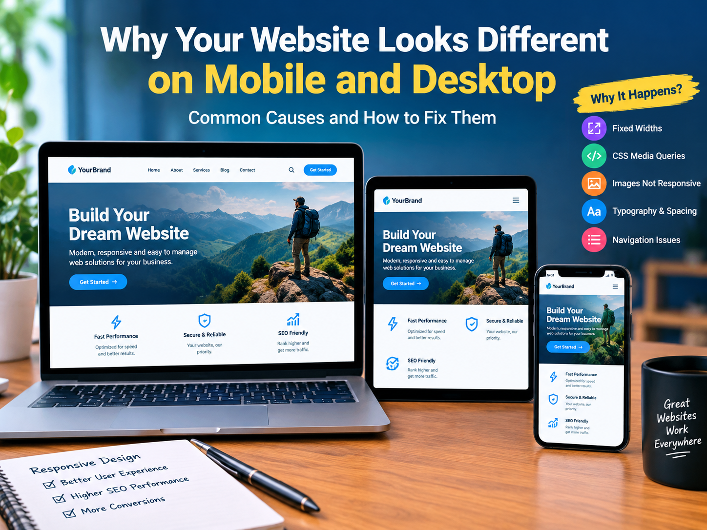
A website may look perfect on a desktop computer but completely different when someone opens it on a mobile phone. Images might become too large, text may overlap, buttons may move out of position, and navigation menus may stop working correctly.
This is one of the most common problems website owners experience, especially when using WordPress, Elementor, Gutenberg, or other page builders.
A responsive website should automatically adjust its layout, images, typography, spacing, and navigation according to the visitor’s screen size. When these elements are not configured correctly, the website can provide a poor experience on mobile devices.
In this article, we will explain why your website looks different on mobile and desktop, identify the most common responsive design problems, and show you practical ways to fix them without damaging your existing website design.
1. What Causes Websites to Look Different on Mobile and Desktop?
Desktop computers, tablets, and smartphones have different screen dimensions. A desktop monitor has more horizontal space, while a smartphone has a much narrower display.
Responsive web design allows a website to adapt to these different screen sizes.
However, several development and design issues can prevent a website from displaying correctly.
Common causes include:
- Fixed-width containers and sections.
- Incorrect CSS media queries.
- Oversized images and background images.
- Desktop-specific typography settings.
- Incorrect padding and margins.
- Navigation menu conflicts.
- Elementor responsive settings.
- CSS and JavaScript conflicts.
For example, a website section designed with a fixed width of 1200 pixels might look good on a desktop but extend beyond the screen on a mobile device.
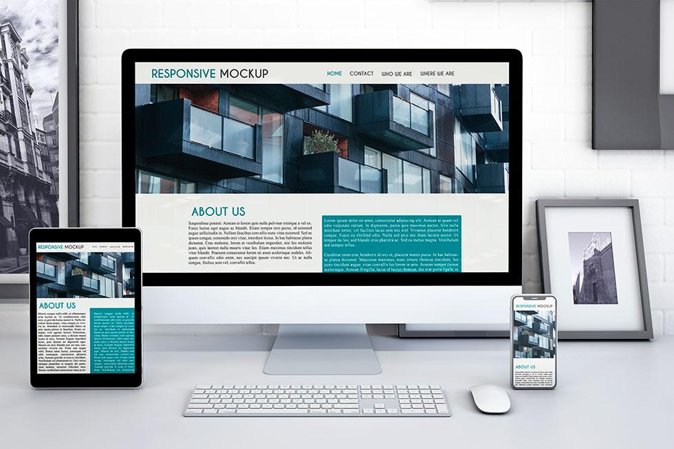
A responsive website should adjust its layout automatically instead of forcing mobile visitors to view a desktop-sized design.
2. Fixed Widths Can Break Mobile Layouts
One of the biggest reasons a website looks different on mobile and desktop is the use of fixed widths.
For example, a developer might use this CSS:
.container {
    width: 1200px;
}
This works on a large desktop display, but it creates horizontal scrolling on smaller screens.
A better approach is to use flexible widths:
.container {
    width: 100%;
    max-width: 1200px;
    margin: 0 auto;
    padding: 0 20px;
    box-sizing: border-box;
}
This allows the container to shrink according to the available screen width.
Recommended solution:
- Use percentages instead of fixed widths.
- Set a maximum width for large containers.
- Use CSS Flexbox or Grid.
- Avoid unnecessary fixed positioning.
- Check every major section on mobile devices.
3. Incorrect CSS Media Queries
CSS media queries allow developers to apply different styles depending on the screen size.
For example, you may want three columns on desktop and one column on mobile.
Use this CSS:
.product-grid {
    display: grid;
    grid-template-columns: repeat(3, 1fr);
    gap: 24px;
}

@media (max-width: 767px) {
    .product-grid {
        grid-template-columns: 1fr;
        gap: 16px;
    }
}
The desktop layout displays three columns, while mobile devices display one column.
Common media query problems include:
- Incorrect breakpoint values.
- Conflicting CSS rules.
- Mobile styles being overridden by desktop styles.
- Missing tablet-specific adjustments.
- CSS selectors targeting the wrong elements.
Tip: Always test your website at multiple viewport widths instead of checking only one mobile screen size.
4. Images and Background Images Are Not Responsive
Images are another common reason for responsive design problems.
A desktop banner might look attractive on a large screen, but important parts of the image can disappear when viewed on mobile.
For example, a large background image may use a fixed height or incorrect background positioning.
Use this CSS for responsive images:
img {
    max-width: 100%;
    height: auto;
    display: block;
}
For background images:
.hero-section {
    background-size: cover;
    background-position: center;
    background-repeat: no-repeat;
}

@media (max-width: 767px) {
    .hero-section {
        min-height: 350px;
        background-position: center;
    }
}
For important banners, consider using a separate mobile image with an appropriate composition.
5. Typography and Spacing Problems
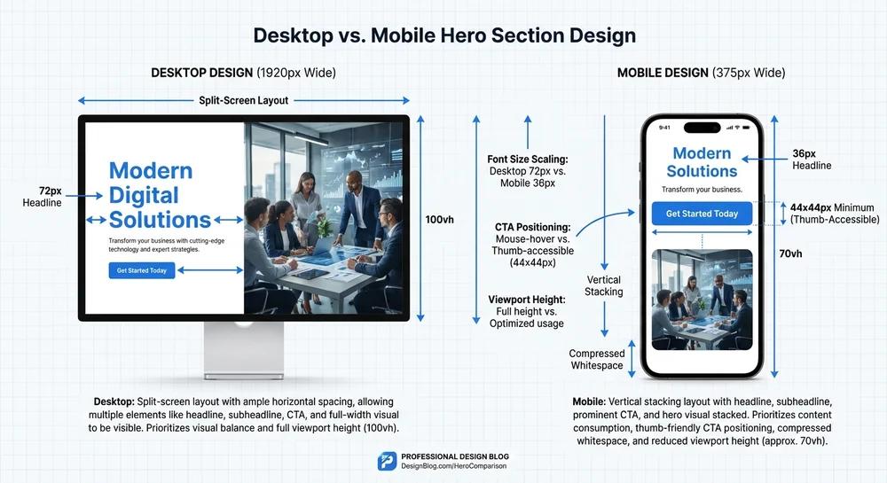
Text that looks readable on a desktop may become too large or too small on mobile.
For example:
- Large headings can wrap awkwardly.
- Paragraphs may become difficult to read.
- Buttons may become too narrow.
- Text can overlap with images.
- Excessive margins can create unnecessary scrolling.
You can use responsive typography with CSS clamp():
h1 {
    font-size: clamp(28px, 4vw, 48px);
    line-height: 1.2;
}

p {
    font-size: clamp(15px, 1.5vw, 18px);
    line-height: 1.7;
}
This allows text sizes to adjust smoothly according to the available viewport.
Avoid using large fixed margins and padding on mobile devices.
6. Common Responsive Website Problems: Visual Analysis
The following chart illustrates common responsive design issues and their relative troubleshooting priority. These values are illustrative, not measured industry statistics.
Common Responsive Design Issues
Illustrative troubleshooting priority scores, not measured website statistics.
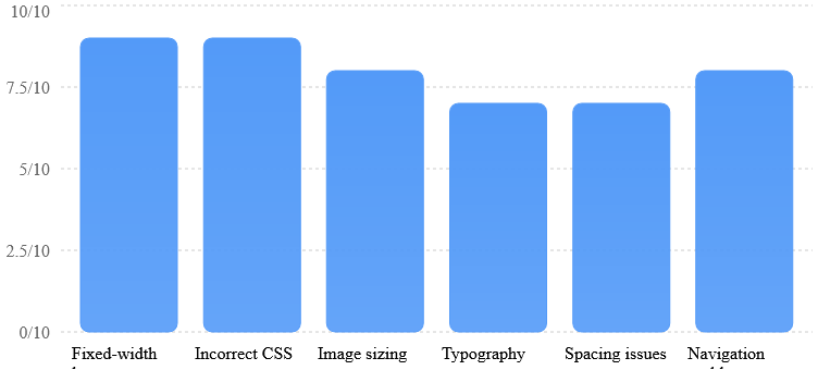
The chart highlights the areas developers should investigate first when diagnosing responsive design problems.
7. How to Fix Responsive Design Problems in WordPress
If your website uses WordPress, Elementor, or Gutenberg, you can fix many responsive design issues directly from the editor.
Step 1: Check Elementor Responsive Settings
Open your WordPress dashboard.
- Navigate to Pages.
- Select the page you want to edit.
- Click Edit with Elementor.
- Open Responsive Mode.
- Select Desktop, Tablet, or Mobile.
- Check section widths, padding, margins, and typography.
- Adjust the settings for each device.

Elementor allows you to customize many design properties separately for different screen sizes.
Step 2: Check Gutenberg and Kadence Blocks
If you use Gutenberg or Kadence Blocks:
- Review the row and section layout.
- Check column stacking settings.
- Adjust mobile padding.
- Check image alignment.
- Review responsive visibility options.
- Test button widths and text alignment.
Do not hide important website content on mobile simply to make the design look correct. Instead, try to fix the underlying layout.
Step 3: Check Mobile Navigation
Navigation menus should be easy to use on smaller screens.
Common mobile navigation problems include:
- Menu items extending beyond the screen.
- Dropdown menus not opening.
- Buttons becoming too small.
- Navigation overlapping the logo.
Use a mobile-friendly menu with a clear toggle button and enough spacing between menu items.
Step 4: Test CSS and JavaScript Conflicts
Sometimes responsive problems happen because of custom CSS or JavaScript.
Open your browser’s developer tools and inspect the affected element.
Check:
- Computed CSS properties.
- Console errors.
- Conflicting media queries.
- Plugin-generated styles.
- JavaScript errors affecting menus or sliders.
If you use caching or optimization plugins, clear the cache after making changes.
8. Which Screen Sizes Should You Test?
Testing only your desktop and personal mobile phone is not enough.
A responsive website should be tested at several viewport widths because visitors use different devices.
The following chart provides a practical testing guide.
Recommended Responsive Testing Widths
Example viewport widths in CSS pixels for testing. These are test targets, not fixed device standards.
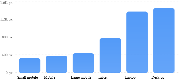
You can test these widths using Chrome Developer Tools.
- Open your website in Google Chrome.
- Press F12.
- Click the device toolbar icon.
- Select a device or enter a custom viewport width.
- Check the complete page from top to bottom.
- Repeat the process at different screen sizes.
Also test on real devices whenever possible. Browser emulation cannot reproduce every real-world mobile interaction.
9. Responsive Website Testing Checklist
Before publishing website changes, complete a responsive design review.
| Testing area | What to check |
|---|---|
| Header | Logo and navigation alignment |
| Homepage | Sections and container widths |
| Images | Correct scaling and cropping |
| Typography | Readable headings and paragraphs |
| Buttons | Proper size and spacing |
| Forms | Fields and submit buttons visible |
| Footer | Columns stack correctly |
| Navigation | Mobile menu works |
| Performance | Images and scripts load correctly |
The following chart shows an example of how a responsive testing process can be distributed across different website areas. These are illustrative planning percentages, not measured industry data.
Example Responsive Testing Effort
Illustrative allocation of testing effort across website areas.
■ Forms and functionality
■ Images and media
■ Layout and sections
■ Navigation and buttons
■ Typography and spacing
10. Why Responsive Design Matters for SEO and User Experience
Responsive design is not just about making a website look attractive.
It also affects how visitors interact with your website.
Google primarily uses the mobile version of website content for indexing and ranking through mobile-first indexing.
If your mobile website has missing content, broken navigation, or difficult-to-use buttons, visitors may have trouble finding the information they need.
A responsive website helps provide:
- Better mobile usability.
- Consistent content across devices.
- Easier navigation.
- Improved accessibility.
- A better user experience.
- More opportunities to convert visitors into customers.
Remember that responsive design alone does not guarantee higher Google rankings. Website content, technical SEO, page experience, and other ranking factors also matter.
11. When Should You Hire a WordPress Developer?
Sometimes responsive issues are more complicated than changing a few CSS properties.
You may need professional WordPress development support if:
- Your website layout breaks after a plugin update.
- Elementor sections display incorrectly on mobile.
- WooCommerce product grids become misaligned.
- Mobile navigation stops working.
- Custom CSS creates unexpected layout problems.
- Your website has persistent horizontal scrolling.
- Responsive fixes damage your desktop design.
A professional WordPress developer can investigate the underlying problem, identify conflicting styles, and implement responsive fixes without unnecessarily rebuilding the entire website.
A website that looks different on mobile and desktop is usually experiencing responsive design issues caused by fixed widths, incorrect CSS, image sizing, typography, spacing, or navigation problems.
The best solution is to identify the actual cause instead of applying random CSS changes.
Whether you use WordPress, Elementor, Gutenberg, or WooCommerce, regularly test your website on different screen sizes.
A properly responsive website creates a consistent experience, makes navigation easier, and helps visitors interact with your business on any device.
Need help fixing your WordPress website’s mobile and desktop layout? Professional responsive design fixes can help make your website work smoothly across smartphones, tablets, and desktop computers.