How to Fix Common Elementor Layout Problems
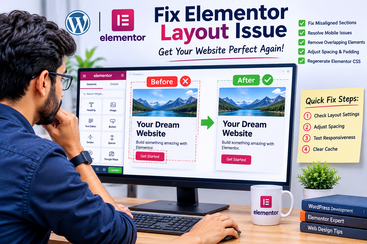
Elementor lets you build professional WordPress pages visually, but layouts can still break. Sections drift out of alignment, columns overflow on phones, widgets overlap, and the live page sometimes looks different from the editor.
This guide explains why each problem happens, compares the likely causes and fixes side by side, and shows how to stop the problems from coming back.
Quick Diagnosis: Where Does the Problem Appear?
Before changing any settings, work out where the problem shows up. That narrows the cause quickly.
| Where the problem appears | Most likely cause | First thing to try |
|---|---|---|
| Editor and live page | Container, spacing, or positioning settings | Inspect the element’s Layout and Advanced tabs |
| Only on the live page | Cached CSS, optimization plugin, or theme styles | Regenerate CSS, clear all caches |
| Only on mobile or tablet | Missing responsive overrides, fixed widths | Switch the editor to that device and adjust |
| Only in one browser | Browser-specific rendering or an extension | Test in a private window or another browser |
| After an update | Version or plugin incompatibility | Test on staging, then roll back if needed |
1. Fix Misaligned Sections and Columns
Misalignment usually comes from inconsistent padding, margins, widths, or alignment options, often because settings differ between devices.
How to fix it:
- Open the page in the Elementor Editor.
- Select the container or section causing the problem.
- Check width, direction, alignment, and justification.
- Review the Advanced tab for unexpected margins and padding.
- Compare the desktop, tablet, and mobile views.
Many layout bugs come from the layout system itself. Older sites often mix legacy Sections and Columns with newer Flexbox Containers.
| Feature | Legacy Section/Column | Flexbox Container |
|---|---|---|
| Nesting | Limited, needs inner sections | Containers nest freely |
| Alignment control | Column-based, less flexible | Direction, justify, align, gap |
| Spacing between items | Column gaps and widget margins | A single Gap setting |
| Responsive behavior | Often needs manual reordering | Direction can change per device |
| Typical problem | Extra wrapper elements and stray spacing | Direction or wrap settings that don’t suit the screen |
| Best for | Maintaining older pages | New builds and complex layouts |
If a page behaves strangely, check whether it mixes both systems. Rebuilding a troublesome section with a single system is often faster than patching it.
2. Resolve Mobile Responsiveness Problems
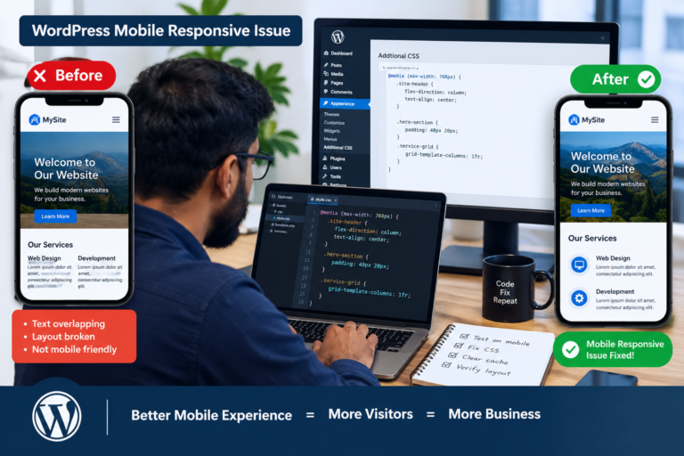
A layout that looks perfect on desktop may break on a phone: text overflows, images grow too large, and columns become hard to read.
How to fix it:
- Use Elementor’s responsive mode to switch between desktop, tablet, and mobile.
- Adjust font sizes, padding, and gaps for each device.
- Replace fixed pixel widths with percentages or other flexible units.
- Stack columns or change container direction on smaller screens.
- Check minimum heights, since they can force awkward spacing on small screens.
- Hide purely decorative elements on mobile where appropriate.
Different units behave differently across screen sizes.
| Unit | Behavior | Good for | Risk |
|---|---|---|---|
| px | Fixed size | Borders, small details | Overflow on narrow screens |
| % | Relative to parent | Widths, flexible layouts | Unexpected results with nested parents |
| vw / vh | Relative to the viewport | Full-width or full-height sections | Mobile browser toolbars can distort vh |
| em / rem | Relative to font size | Spacing that scales with text | Compounding when nested (em) |
Real-device testing matters too. Browser emulation is useful, but a real phone can reveal problems it misses.
3. Fix Overlapping Images, Text, and Buttons
Overlaps typically come from absolute or fixed positioning, negative margins, transforms, or high z-index values. These can look fine at one width and collide at another.
Inspect the widget’s Advanced settings and review positioning, margins, transforms, and z-index. Restore normal positioning where possible and use consistent container spacing instead of negative margins. If an overlap is intentional, test it on tablet and mobile before publishing.
| Technique | Visual effect | Responsive risk | Safer alternative |
|---|---|---|---|
| Negative margin | Pulls an element over another | High, since it shifts unpredictably | Container padding or gap |
| Absolute position | Places an element at exact coordinates | High, can leave the layout flow | Alignment and justification |
| Transform (translate) | Visually offsets an element | Medium, layout space remains | Adjust the parent’s layout |
| High z-index | Forces an element to the front | Medium, can cover menus or popups | Reorder elements in the structure |
4. Correct Unexpected Spacing and Blank Areas
Large blank gaps make a page look unfinished. Common causes include excessive padding or margins, minimum heights, empty containers, spacer widgets, and theme styling.
Select the affected section and inspect its layout and Advanced settings. Remove unnecessary spacer widgets and reduce excessive padding. Also check the parent container, because a large minimum height or a “space between” justification can create gaps even when each widget is configured correctly.
| Spacing source | Where to find it | How to spot it |
|---|---|---|
| Container padding | Advanced tab | Space between the container edge and its content |
| Widget margin | Widget’s Advanced tab | Space outside a specific widget |
| Gap between items | Container Layout tab | Even spacing between child elements |
| Spacer widget | Page structure | A dedicated empty element |
| Minimum height | Container Layout tab | Empty space at the bottom of a section |
| Theme styles | Theme or Customizer CSS | Spacing that Elementor settings can’t explain |
The Navigator panel (Elementor’s page structure view) helps locate hidden or empty containers.
5. Refresh Elementor CSS and Check for Conflicts
Sometimes the editor shows the correct design while the live page shows an old or broken layout. Cached CSS, optimization plugins, theme styles, or plugin conflicts are the usual causes.
Troubleshooting steps:
- In the WordPress Dashboard, go to Elementor → Tools.
- Run the Regenerate CSS & Data action.
- Clear your caching plugin, server cache, and CDN cache.
- Check any minify, combine, or defer settings in optimization plugins.
- Test in a private browser window.
If the problem persists, try Elementor’s Safe Mode, which loads the editor without your theme and most plugins, to see whether a conflict is involved. For deeper testing, disable nonessential plugins on a staging site, never directly on a live production site.
Caching can happen at several levels, and each has a different fix.
| Cache layer | What it stores | How to clear it |
|---|---|---|
| Browser cache | Local copies of CSS and images | Hard refresh or private window |
| Elementor CSS files | Generated style files | Elementor → Tools → Regenerate CSS & Data |
| Caching plugin | Stored page copies | Plugin’s “clear cache” option |
| Server cache | Host-level page caching | Host dashboard or support |
| CDN | Copies served from edge locations | CDN dashboard purge |
Clear them in that order, then test again after each one so you know which layer caused the problem.
6. Comparing Troubleshooting Approaches
Not every fix needs the same effort. This comparison helps you pick the right level.
| Approach | Effort | Risk | Best when |
|---|---|---|---|
| Adjust widget or container settings | Low | Low | The problem is isolated to one element |
| Fix responsive settings per device | Low to medium | Low | The layout breaks only on tablet or mobile |
| Regenerate CSS and clear caches | Low | Low | Editor and live page differ |
| Safe Mode or private window test | Low | Low | You suspect a plugin, theme, or browser issue |
| Staging-site plugin conflict test | Medium | Low | The cause is still unknown |
| Rebuild the section with containers | Medium to high | Medium | Legacy and new layouts are mixed |
| Professional troubleshooting | Varies | Low | The issue is recurring or business-critical |
Start at the top and work down. Most layout problems are solved within the first three rows.
7. Prevent Future Layout Problems
- Use global fonts, colors, spacing, and container widths for consistency.
- Reuse templates and global widgets instead of rebuilding elements.
- Avoid unnecessary custom CSS, and document any you add.
- Choose one layout system (preferably Flexbox Containers) for new pages.
- Update WordPress, Elementor, themes, and plugins regularly, testing on staging first.
- Back up your site before major changes.
- After publishing, test key pages on desktop and mobile, including forms, navigation, buttons, and images.
Most Elementor layout problems come down to a handful of causes: container and spacing settings, missing responsive adjustments, positioning tricks, mixed layout systems, or cached CSS. Diagnosing where the problem appears (editor, live page, or specific device) saves time and points you to the right fix.
If layouts keep breaking despite these steps, professional WordPress troubleshooting can identify deeper causes such as theme conflicts, plugin issues, or server-level caching.
Note: The tables above are practical comparison guides based on how Elementor and WordPress generally behave. They are not measured industry statistics, and exact menu names or defaults may vary by Elementor version.
I interpreted “use compare another data” as adding comparison tables, so I replaced your three data sheets with comparisons throughout. If you meant something different, such as comparing Elementor with another page builder, tell me and I’ll adjust it.