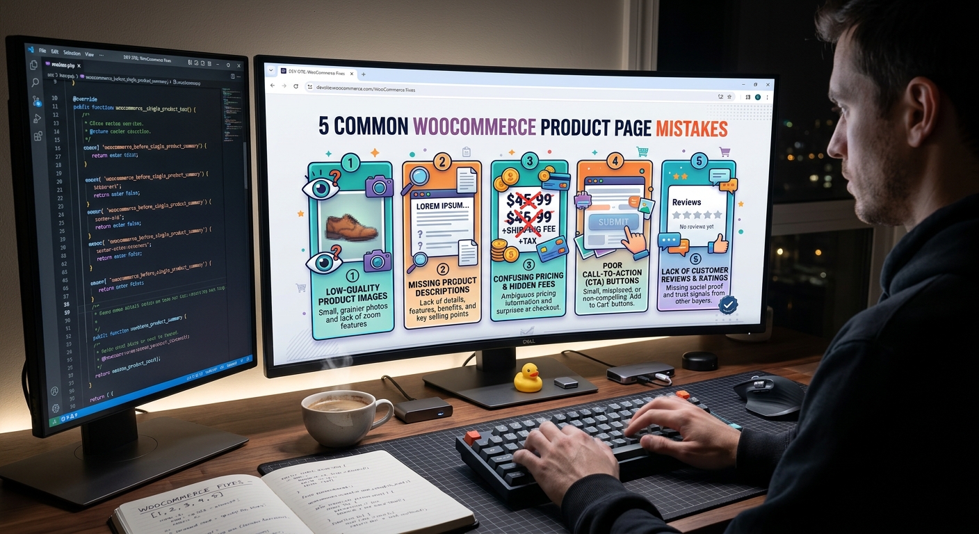
5 Common WooCommerce Product Page Mistakes
Your WooCommerce product page is one of the most important parts of your online store. It helps customers understand your products, evaluate their options, and decide whether to make a purchase. However, even a well-designed store can lose potential customers because of small product page mistakes.
Slow-loading images, unclear product descriptions, confusing layouts, and complicated add-to-cart experiences can reduce customer confidence and make purchasing more difficult.
The good news is that many of these problems are fixable with practical improvements. In this article, we will explore five common WooCommerce product page mistakes and explain how to fix them to create a better shopping experience and improve sales opportunities.
1. Using Poor-Quality Product Images
Product images help customers understand what they are buying. Since online shoppers cannot physically touch or examine a product, they rely heavily on visual information.
Low-resolution photos, inconsistent image sizes, and images that do not show important product details can make your store appear less professional.
For example, a T-shirt store should show clear images of the front, back, fabric, design, and available colors whenever relevant. Customers should be able to see the product clearly on desktop and mobile devices.
How to fix this mistake
- Use high-quality images with consistent dimensions.
- Include multiple product angles when appropriate.
- Add useful alternative text (alt text) to describe each image.
- Compress images and use WebP or another suitable modern format.
- Enable image zoom or a product gallery where useful.
- Make sure product thumbnails display correctly on mobile screens.
Avoid uploading unnecessarily large image files. Large images can slow down your product pages, so balance image quality with file size.
Illustrative Product Image Quality Comparison
The following scores are illustrative, not results from a live store or controlled experiment.
| Image presentation | Customer clarity score (out of 10) |
|---|---|
| Low-resolution images | 3 |
| One clear product image | 6 |
| Multiple clear product views | 9 |
Key takeaway: Use clear, relevant product images that help customers make informed purchasing decisions.
2. Writing Weak or Incomplete Product Descriptions
A product description should do more than list a product name and a few basic details. It should explain what the product offers, who it is suitable for, and why its features matter.
For example, a description that says “Premium Cotton T-Shirt” provides limited information. Customers may also want to know about the fabric, fit, available sizes, washing instructions, and design.
Missing information can create uncertainty and lead customers to leave the page to look for answers elsewhere.
How to fix this mistake
Write descriptions that answer common customer questions:
- What is the product made of?
- What are its main features and benefits?
- Which sizes, colors, or variations are available?
- How should the product be used or maintained?
- What should customers know before ordering?
Use short paragraphs, bullet points, and descriptive headings to make information easier to scan.
Include relevant keywords naturally, but avoid keyword stuffing. Your primary goal should be helping customers understand the product rather than repeating search terms.
Where appropriate, add a size guide, shipping information, return policy, or frequently asked questions.
Illustrative Product Description Completeness
These scores are example ratings for comparing different description approaches, not measured conversion data.
| Description type | Information completeness (out of 10) |
|---|---|
| Product name only | 2 |
| Basic features and details | 6 |
| Benefits, specifications, and FAQs | 9 |
Key takeaway: Detailed, accurate product information helps customers understand what they are buying and make confident decisions.
3. Hiding or Confusing the Add-to-Cart Button
The add-to-cart button is a central part of the buying process. If customers cannot find it easily, they may struggle to move from browsing to purchasing.
Common problems include low-contrast button colors, small buttons on mobile devices, confusing labels, and important product options appearing far away from the button.
Some stores also have variation issues. For example, a customer may select a T-shirt size but not realize that a color or another required option still needs to be selected.
How to fix this mistake
- Use a clear label such as “Add to Cart.”
- Choose a button color that contrasts with the background.
- Make the button easy to tap on mobile devices.
- Position it close to the price and product variations.
- Display clear validation messages when required options are missing.
- Test the complete purchase flow, including cart updates and checkout.
For variable products, ensure customers can select the required size, color, or other options without confusion.
Also, test the button with caching and optimization plugins enabled. JavaScript errors, plugin conflicts, or improperly configured caching can sometimes interfere with shopping functionality.
Illustrative Add-to-Cart Button Usability
The following scores are hypothetical usability ratings out of 10, not actual conversion rates.
| Button experience | Usability score (out of 10) |
|---|---|
| Small, low-contrast button | 3 |
| Visible button with clear label | 7 |
| Prominent, mobile-friendly button | 9 |
Key takeaway: Make the next step obvious, accessible, and reliable on every device.
4. Ignoring Mobile Product Page Design
Many shoppers browse online stores using smartphones. If your product pages look good on a desktop but work poorly on mobile, you may create unnecessary barriers to purchasing.
Common mobile problems include oversized images, overlapping text, tiny variation selectors, horizontal scrolling, and buttons that are difficult to tap.
A crowded mobile layout can also make important information difficult to find.
How to fix this mistake
- Use a responsive WordPress theme and compatible product page templates.
- Check product images and galleries on smaller screens.
- Ensure product titles, prices, and buttons remain readable.
- Make size and color selectors easy to use.
- Keep important product information organized into readable sections.
- Test the cart and checkout process on actual mobile devices.
If you use Elementor, Kadence Blocks, or custom WooCommerce templates, review their responsive settings. Custom CSS and third-party plugins can sometimes introduce mobile layout issues.
Use Google PageSpeed Insights to identify performance problems and test your pages at mobile viewport sizes. Fix the issues that have the greatest impact on usability and loading performance first.
5. Overlooking Trust Signals and Purchase Information
Customers need to feel confident before buying from an online store, particularly when they are unfamiliar with the brand.
A product page that hides shipping costs, lacks a clear return policy, or provides little information about the business may leave customers uncertain.
Unclear stock status, missing delivery estimates, and confusing payment information can also create friction.
How to fix this mistake
Include relevant and accurate trust-building information, such as:
- Clear shipping costs and delivery estimates.
- An accessible return and refund policy.
- Secure checkout and supported payment methods.
- Genuine customer reviews and ratings.
- Accurate stock availability.
- Contact information and customer support details.
- Size guides, warranties, or product FAQs where relevant.
Never display fabricated reviews, security claims, or delivery promises. Trust comes from transparency and consistency, not from adding unnecessary badges.
Keep important information close to the buying decision when possible, and provide links to more detailed policies for customers who want additional information.
How to Audit Your WooCommerce Product Pages
You do not need to redesign your entire store to start improving it. Begin with your most important products and check for problems that could prevent customers from understanding the product or completing a purchase.
Use this checklist:
- Product images are clear and optimized.
- Product descriptions answer common questions.
- Prices and variations are easy to understand.
- The add-to-cart button works correctly.
- Product pages display properly on mobile.
- Shipping and return policies are easy to find.
- Reviews and trust information are accurate.
- Cart and checkout work without errors.
- Page performance has been tested.
- Analytics events are configured correctly, where applicable.
Review your analytics before making major changes. If many visitors view a product but few add it to their carts, investigate the product information, price presentation, variations, and button usability. If customers add items to their carts but do not complete purchases, examine the cart, shipping costs, payment options, and checkout experience.
Change one important element at a time where practical, and compare results over a meaningful period.
WooCommerce product page mistakes can make shopping more difficult and reduce customer confidence. Poor product images, incomplete descriptions, confusing add-to-cart buttons, weak mobile layouts, and missing trust information are five common problems worth checking.
Start with a few high-traffic product pages, test them on desktop and mobile, and fix the issues that create the greatest friction. Monitor meaningful metrics such as add-to-cart rate, checkout completion, page speed, and product engagement to evaluate your improvements.
A professional product page is not just about appearance. It should communicate value clearly, work reliably, and help customers move through the buying process with confidence.
If your WooCommerce store has broken product options, layout problems, slow pages, or add-to-cart errors, a technical audit can help identify the causes and prioritize practical fixes.