How to Fix Mobile Responsive Issues in WordPress
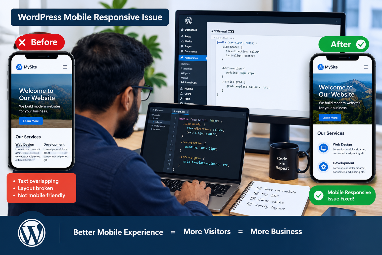
A WordPress website may look professional on a desktop computer but appear broken on a mobile phone. Text may overlap, images may extend beyond the screen, buttons may become difficult to click, and navigation menus may not work correctly. These problems can frustrate visitors, reduce engagement, and make it harder for potential customers to contact your business or complete a purchase.
Learning How to Fix Mobile Responsive Issues in WordPress helps website owners improve usability, accessibility, and the overall browsing experience across smartphones, tablets, laptops, and desktop computers.
In this guide, you will learn the common causes of WordPress mobile responsiveness issues, practical troubleshooting methods, how WordPress compares with other website platforms, and what available data can tell us about the causes of responsive design problems.
Why Is Mobile Responsiveness Important?
Responsive web design allows a website to adjust its layout according to the visitor’s screen size. Instead of requiring users to zoom in or scroll horizontally, a responsive website adapts its content, images, navigation, and columns to the available space.
Mobile performance matters because visitors use a wide range of devices to browse the internet, shop online, read articles, and contact businesses.
According to StatCounter’s global platform statistics, mobile devices account for a substantial share of worldwide web traffic. You can explore the latest figures on its Global Stats website.
For a business website, a poor mobile experience can lead to:
- Visitors leaving pages because the content is difficult to read.
- Lower engagement with service pages and blog articles.
- Frustrating checkout experiences in WooCommerce stores.
- Buttons and forms that are difficult to use.
- A less professional impression of the business.
A mobile-friendly design is therefore an important part of website maintenance, user experience, and conversion optimization.
Common WordPress Mobile Responsiveness Issues
Before fixing a layout, identify the specific problem. Different symptoms can have different causes.
| Mobile issue | Common cause | Recommended fix |
|---|---|---|
| Horizontal scrolling | Fixed-width elements or oversized images | Use flexible widths and responsive images |
| Text overlapping | Fixed font sizes or narrow containers | Use responsive typography and spacing |
| Images overflowing | Fixed image dimensions | Apply max-width: 100% |
| Navigation menu broken | Theme or menu configuration | Check mobile menu settings |
| Columns too narrow | Desktop layout retained on mobile | Stack columns vertically |
| Buttons difficult to click | Small controls or tight spacing | Improve button size and spacing |
| Layout changes after loading | Delayed scripts, fonts, or CSS | Investigate loading behavior and optimization settings |
How to Fix Mobile Responsive Issues in WordPress
1. Test Your Website on Different Screen Sizes
Start by identifying which pages have problems. Check the homepage, blog posts, service pages, contact forms, and checkout pages.
You can use Chrome DevTools to simulate different screen sizes:
- Open your WordPress website in Google Chrome.
- Right-click the page and select Inspect.
- Click the device toolbar icon.
- Select a smartphone or tablet preset.
- Check for horizontal scrolling, overlapping text, cropped images, and broken navigation.
- Test important buttons, forms, and menus.
Also test the website on a real phone when possible. Browser simulation is useful, but it may not reveal every touch interaction, font-rendering issue, or device-specific problem.
2. Fix Fixed-Width Elements With Responsive CSS
One of the most common causes of mobile layout problems is a fixed width that works on desktop but exceeds the available space on a smaller screen.
For example, this CSS can cause overflow:
.content-box {
    width: 900px;
}
On a phone, a 900-pixel container may extend beyond the viewport.
A more flexible approach is:
.content-box {
    width: 100%;
    max-width: 900px;
    margin-inline: auto;
    box-sizing: border-box;
}
This allows the element to shrink on smaller screens while limiting its maximum width on larger displays.
Add CSS through Appearance → Customize → Additional CSS if your theme provides that option, or use your theme’s designated custom CSS area.
Always check existing theme styles before adding new rules, as conflicting CSS may override your changes.
3. Make Images and Videos Responsive
Large images, banners, embedded videos, and third-party widgets can create horizontal scrolling.
For standard content images, try:
img {
    max-width: 100%;
    height: auto;
}
This helps images remain within their parent containers while preserving their proportions.
For video embeds, use a responsive wrapper or the responsive settings provided by your theme or page builder. Check that image galleries, sliders, and embedded maps also fit the mobile viewport.
Do not apply broad CSS rules blindly to every image. Logos, icons, and intentionally cropped backgrounds may require separate styling.
4. Adjust Font Sizes, Margins, and Padding
A heading that looks attractive on a large monitor may wrap awkwardly on a mobile phone. Excessive padding can also leave too little space for the actual content.
CSS clamp() allows font sizes to adjust smoothly between defined limits:
.responsive-heading {
    font-size: clamp(1.5rem, 4vw, 2.5rem);
    line-height: 1.2;
}

.responsive-section {
    padding: clamp(16px, 4vw, 40px);
}
The heading scales with the viewport while remaining within a readable range. Section padding also adjusts to available screen space.
If you use Elementor, Gutenberg, Kadence Blocks, or another page builder, review its mobile typography, margin, padding, alignment, and visibility settings before adding custom CSS.
5. Fix Columns and Navigation Menus
Desktop layouts often use two or three columns. On mobile, those columns may become too narrow or cause content to overflow.
Use your theme or page builder’s responsive controls to stack columns vertically. Keep related content together and ensure that the reading order remains logical.
For navigation, check that:
- The mobile menu opens and closes correctly.
- Menu labels are readable.
- Dropdowns work with touch input.
- The logo does not push the menu outside the screen.
- Buttons such as “Contact Us” remain accessible.
Avoid hiding essential content simply to make the page fit a smaller screen.
6. Check Plugins, Themes, and Caching
WordPress themes and plugins can introduce responsive conflicts, particularly after updates or when several tools control the same layout.
If a problem appears suddenly:
- Clear your WordPress caching plugin’s cache.
- Purge your CDN cache if you use one.
- Check whether CSS or JavaScript optimization changes the layout.
- Review recent theme, plugin, or custom CSS changes.
- Test conflicting plugins on a staging site, one at a time.
Do not deactivate plugins on a live business website without considering the effect on checkout, forms, security, and other essential features.
WordPress vs. Other Website Platforms: Mobile Responsiveness Comparison
WordPress is not automatically less mobile-friendly than other website platforms. The result depends on the theme, page builder, plugins, custom code, and testing process.
For comparison, Squarespace documents built-in responsive behavior that resizes content and stacks layouts on mobile devices. WordPress offers a more customizable environment, but the quality of the result depends on how the selected theme and components are configured.
| Feature | WordPress | Squarespace | Wix |
|---|---|---|---|
| Responsive layouts | Depends on theme and components | Built-in responsive behavior | Responsive tools and editor controls |
| Custom CSS | Extensive flexibility | Available, with compatibility considerations | Available, with platform-specific constraints |
| Plugin or extension conflicts | Possible | Generally fewer third-party plugin dependencies | Generally fewer third-party plugin dependencies |
| Developer control | High | More platform-controlled | More platform-controlled |
| Troubleshooting | May involve themes, plugins, CSS, and JavaScript | Often involves layout and style settings | Often involves editor layout and responsive settings |
This is a qualitative comparison, not a controlled performance test. It does not mean every Squarespace or Wix site is responsive or that every WordPress website has problems.
What percentage of websites have mobile responsiveness issues?
There is no single reliable percentage that applies to all websites and all types of responsive problems. A website may pass one mobile test but still have a broken menu, overlapping text, or a checkout issue on another device.
A more useful approach is to test your own website and report the percentage of pages or test cases that fail.
For example, if you test 20 important pages and find that 5 have mobile layout problems, your own test result is:
\[ \frac{5}{20}\times100=25\% \]
This is a measurement of your tested pages, not an estimate of all WordPress websites.
What Percentage of Responsive Issues Are Caused by Programming?
This is an important question for website owners considering professional WordPress development. However, there is no verified universal percentage showing that programming is responsible for a specific share of WordPress responsive issues. Assigning an unsupported figure such as 60%, 70%, or 80% would be misleading.
Responsive problems can come from several sources:
| Potential cause | Example | How to investigate |
|---|---|---|
| CSS or JavaScript coding | Fixed widths, conflicting media queries, scripts changing layouts | Inspect styles and browser errors |
| Theme configuration | Incorrect mobile header or column settings | Review theme responsive controls |
| Page builder settings | Desktop padding applied to mobile | Inspect device-specific settings |
| Plugin conflicts | Slider or popup extends beyond the screen | Test on staging with controlled plugin changes |
| Content and media | Oversized images or long unbroken text | Inspect image dimensions and content |
| Caching and optimization | Outdated or incorrectly combined CSS | Purge caches and test optimization settings |
These are diagnostic categories, not percentages of responsibility.
Programming may be the main cause when custom CSS uses fixed dimensions, media queries are missing, or JavaScript modifies elements incorrectly. However, if the problem comes from a page builder setting or an oversized image, rewriting code may not be necessary.
How to Measure the Cause on a Real Website
A developer can perform a small audit and categorize each confirmed issue by its root cause.
For example, imagine an audit identifies 40 distinct mobile issues:
- 14 caused by custom CSS or JavaScript
- 10 caused by theme or page builder settings
- 8 caused by plugins
- 5 caused by content or images
- 3 caused by caching or optimization
In this hypothetical example, coding-related issues represent 35% of the total:
\[ \frac{14}{40}\times100=35\% \]
These figures are illustrative only, not industry research. On a different website, the results could be very different.
This evidence-based approach helps a developer explain what went wrong, what needs to be fixed, and whether the solution requires code changes or configuration adjustments.
Mobile Traffic Data: Why Responsive Design Matters
StatCounter’s 2025 global traffic figures indicate that mobile devices accounted for approximately 58.5% of worldwide website traffic, compared with roughly 39.5% from desktop devices. The remaining share came primarily from tablets and other categories.
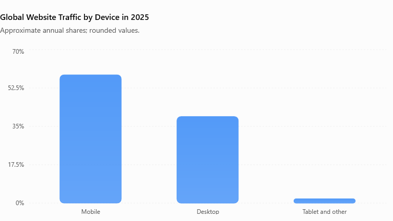
Global Website Traffic by Device in 2025
Approximate annual shares; rounded values.
These figures measure device traffic, not the percentage of websites with responsive problems. Nevertheless, they show why mobile testing should be a standard part of website development.
Mobile Responsive Testing Checklist
Before publishing changes, use this checklist to review your website.
- No unwanted horizontal scrolling.
- Headings and paragraphs are readable.
- Images and videos fit their containers.
- Columns stack correctly on small screens.
- Navigation menus open and close correctly.
- Buttons and links are easy to tap.
- Contact forms work on mobile devices.
- WooCommerce cart and checkout pages function properly.
- Changes work after clearing the cache.
- Important pages have been tested on a real smartphone.
Frequently Asked Questions
1. Why is my WordPress website not mobile friendly?
Common reasons include fixed-width CSS, incorrect theme settings, page builder spacing, plugin conflicts, oversized images, and outdated stylesheets. Test the affected page before deciding which fix is appropriate.
2. Can I fix WordPress mobile layout problems without coding?
Yes. Many problems can be corrected through responsive controls in your theme or page builder. Custom CSS or JavaScript may be necessary when the problem comes from the underlying implementation.
3. Does mobile responsiveness affect SEO?
A mobile-friendly experience supports usability and aligns with Google’s mobile-first indexing approach. However, responsive design alone does not guarantee higher rankings. Content quality, performance, accessibility, and other SEO factors also matter.
4. Which tools can I use for WordPress responsive design troubleshooting?
Start with Chrome DevTools for viewport testing, Google PageSpeed Insights for performance diagnostics, and the official WordPress responsive styles documentation for block styling guidance.
5. What percentage of mobile responsive issues are caused by developers?
There is no reliable universal percentage. Some issues result from programming errors, while others come from theme settings, plugins, content, or caching. A website-specific audit is the best way to estimate the contribution of each category.
Learning How to Fix Mobile Responsive Issues in WordPress starts with identifying the root cause rather than applying random CSS changes. Test your pages across different screen sizes, fix fixed-width elements, optimize typography and images, review page builder settings, and investigate plugin or caching conflicts.
Because mobile devices account for a substantial share of website traffic, responsive testing should be part of every WordPress development and maintenance workflow.
If you manage a business website, regularly checking its mobile layout can help you deliver a more reliable experience to visitors and customers. For complex problems involving custom CSS, JavaScript, or WooCommerce checkout layouts, a structured technical audit can identify the cause and help prevent the same issue from returning.